Showing posts with label sandhi schimmel gold. Show all posts

Friday, April 3, 2015

Oh Venice, you did it again...UPDATED 4/4/15

PLEASE SCROLL DOWN FOR UPDATES:

Third trip to Italy - this time I visited Rome, Cinqueterre, Mantua and Venice...and this time was the first time with my darling husband.

I was inspired EVERYWHERE, and wandering the streets [canals] and alleys of Venice always leads me to something that inspires me. Everything outside and inside. I have more ideas than hours in the day.


On our last day, we were off in a different direction when i came upon a gallery that took my breath away.

Too bad they were already closed, I might have tried to purchase everything. Yes, I took photos through the window. Naughty me. Look at Dusciana Bravura's amazing sculptures online. But...the wall of little square mosaics captured my attention.

Check these out! Of course, they are made from GLASS...I don't know if theyre grouted or fused or what... but they are meticulously made from glass tiles, mirrors, millifiore cane, maybe cermics?


I know how to create glass mosaics, but I work in paper. This display gave me an idea that I could incorporate [borrow...steal...?] into my work with junk mail and found objects.

So with proper PROPS to Dusciana Bravura... here's my venture into creating small pieces: on canvas - using/ upcycling a smattering of stuff I had on hand - in my many drawers of junk mail, Christmas cards, ceramic tiles, beads, crystals and jewels from my Grandmother and Mom's collection [they were jewelers in the 50's] mirrors, rhinestones, electronic parts, hardware [tacks, bolts, etc.]. souvenirs, wood, clock parts, napkin rings, glitter, glass beads, bobbins, plastic toys and more:

 Now I'm obsessed with making more! So far, I've made 16. They are 6x6", on thick canvas. They're painted all around with lace trim on the side... very shiny and no two are alike. They have a very high gloss coating. Here are some detail pics:


I have a few more ideas up my sleeve from that trip... 

For you non-creative types... LOOK AROUND YOU and you'll find a world of inspiration!

I'm calling this collection of little canvases "Miroir aux Alouettes"
Each piece has mirrors - round, tiny squares or larger ones. All of them include gold leafing and reflective materials. The term refers to traps used to catch larks. They had tiny mirrors on them, to attract the birds that like "shiny things!" All of the canvases are coated several times with a glossy medium; some have glitter, some are irridescent, some contain glass beads or other shiny lacquers. 
24 as of 4/7/2015


Wednesday, October 29, 2014

Shut Up and F*@$ing Kiss Me, Already!

Shut up and Kiss Me...again! Again!

I've always wanted to show my art in Miami. It's been a goal to get into Art Basel, but I'm not represented by a gallery that will be there. So, I found another way to be Art Basel-adjacent.
I have a few things I want to show, but the most popular image I've ever created is called...
"Shut Up and Kiss Me."
I got out the sketch book and played with an image I've done before... a few times, in different sizes, different color schemes, different styles, different compositions each time.
They're not the same!
They're all one of a kind, all drawn by hand, using a whole group of new materials. I improvise as I go...after all, the impulse is the action!

Newest version, bad lighting...in my studio just after completion.

I decided to share a bit of my process with you by taking photos as I went along...  you'll see, if you look closely, I change the drawing, the color scheme, and make adjustments to different features. And, it's all done by hand, there are no computer programs that I use, just old-fashioned ART.
I hope you like seeing the process over a length of time.

Some of the strips of orange junk mail I was sorting...and my high tech cutting tool!

One version, in a private collection in New York

Another version, in a private collection in Texas

Another version, in a private collection in Mexico
The newest version is 30x40" - and will debut in Ft. Lauderdale, Florida - November 15th, 2014
You're invited!
click here for more info on the opening                                            
And then here:


Monday, September 23, 2013

But does it match the couch?

At an art festival this weekend, I was approached by a really interesting character who got my grey cells bouncing around my noggin'. He called himself Seemore. [Have you met him?} His name is
SEEMORE
Charles Simmons and he is a BIG booster for his home town.


Occasional art festivals are one way I get to meet the public, take my show on the road... and hopefully make some sales of my work. Say what you will about art... I consider it my profession, and have no qualms about finding various ways to make a living.
It's a mixed bag.

Anyway, Seemore stopped by and told me he was looking for 
the next Martha Stewart. He thought it might be me! [Or maybe he says that to all the girls... or every artist he meets...] 

Well, I consider myself pretty clever, creative, can do all sorts of things... I can draw, and paint and grout tile with the best of them. I can design clothes, I can make a sample handbag from my own designs, I can dress a mannequin, darn socks, dye easter eggs, create sets for theatre, fashion floral centerpieces, do window displays, am a gourmet cook, do creative writing and make all sorts of art and craft thingamabobs. I don't have any livestock, but would love a sheep in the backyard to match my designer dachshunds. So, perhaps I fit his bill for the next Martha?

Seemore's actual purpose in attending the show was to find people [like me?] to come to High Point, NC. To visit, to perhaps participate in trade shows or be/display/rent in a showroom? I'm not quite sure. But, to be "discovered" as the "Next BIG Thing" seemed to be what he thought I could achieve in High Point. Or not. He was very honest.


"Dakota Daughter" Scottsdale, AZ
"Sheherazade" Stamford, CT
A RED wall!
He said some marvelous things about my artwork. And, my sense of color. However... he also uttered the phrase...asked the questions that many artists abhor... "But does it match the couch?"

 Apparently, interior designers who pick furniture, fabrics, accessories and ART for their clients in High Point and every where else... can make an artists' career if their work "matches the couch."


A Blue couch!
Seemore suggested I create work that will match fabrics and interiors that designers look for... and although I could almost say color schemes and palette I pick are something I "can't help doing" - from my inspiration in the moment, my thought process... I don't know...
Am I crazy for using COLORS??? 

"Ever" Museum Collection
Outrageous color combination!
Should I start perusing magazines looking for the latest trends in interior design so I can be more marketable? 
Are we still in the Tuscany trend? 
I haven't painted any villas or poplars recently...[ever?]


"Chauconne" Houston, TX
I never really thought about it before, and all the pieces shown here have sold... so someone somewhere must like red, purple, orange, yellow, teal and lime green! I guess a small minority.

I know most people are afraid of color [I had to paint my last house BEIGE so it would sell].

PURPLE????
I know most people don't like portraits. I know most people can't afford to buy original art. I get it, I get it...

If the point of making art... is not only to express yourself, but to also earn your way, pay your bills and put your kids through college - is that unreasonable? Is it time to SELL OUT and go beige or greige or sage green?

"The Karen E Project" Redondo Beach, CA
"Coco Rocha" New York, NY
"Can I get a Kiss? - Mexico City

 
What, neon colors? Unheard of.
Speaking for myself... Is creating DECOR that matches the couch the way to go?

An orange couch?
I guess I could make a lot more money if I did dog portraits...or flowers... or aspen trees... or landscapes or ponds or... the dreaded 
giant pear paintings. 

But, when I walk into my studio - and just create out of my
imagination, faces appear on the canvas 9 times outta 10. 
Colors that may or may not "go" together, or match a couch [Okay, I am being a smart ass here and I know it] get tossed together willy-nilly.

I know there is no real answer here, and I am sure if anyone bothers to comment... the opinions will be wildly different.

"Robin's Blue Bedroom Eyes - San Diego
Teal and Brown...that's more like it.
I am really glad I met Seemore, and might go visit him in High Point, or take a gander at design magazines... after all, being the next Martha Stewart would alright with me. I am sure I can stay out of prison or if I did end up in jail, I'd take up
Martha upon her release...with her knitted poncho
knitting ponchos, too.

Or better yet...  
the next Walt Disney
[after all, Walt & I share the same Myers Briggs ENTP personality type]

Like Seemore said...  
"You never know when Mickey Mouse is going to become Disneyworld."

So, what do you think?

By the way, if you want to be on my email newsletter list... 
go to THIS page and sign up.

Friday, September 20, 2013

What's in a Face?

Wolf whistles...Scorn...Desire...Adoration...a Mother's Love...Rejection...Swoons.
It starts with the face.

Babies are born looking like their fathers...  so they'll know the child is theirs and won't run off. Well, at least that's what I've heard, and it is certainly true of me and of my own daughter.

What is attractive? Repulsive? Beautiful? Sexy? Attraction is physical, "chemical," intuitive. We respond to what we like. So, most of us are stuck with what we're born with, other "enhance" with products and poisons and knives...to reach an ideal...and that target is always moving.

One man's meat is another man's poison
One man's meat is another man's person

My Mother told me...never trust someone with thin lips, or close-set eyes.

So, What's in a Face?


After all...aren't most of our face comprised of two eyes, two lips, one nose? Are not our faces merely skin stretched [or sagging] over muscle and bone? What's the big deal?

And yet... so much is made of our visual appearance. If you've read my blog, seen my art or know me, you know I have been exploring how our "looks" relate to our own self-image, and the messages we hear and tell ourselves. This collage was originally completed several years ago, soon after I dealt with a slight change to my own face [no one sees it, but it is glaring to me] which altered my impression of myself and others. 

Included in this composition are photos, textures, verbiage, people I know, and many others I don't.
Here are some details. I'm in there somewhere...and I don't look like Kate Moss.


Thursday, January 17, 2013

"Peor es Nada"

So - who are you - the product of your DNA or who society labels you as?


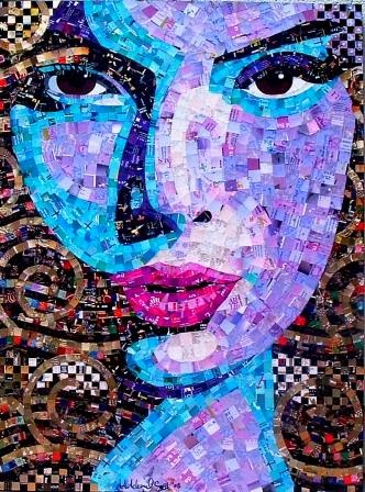
This is a new, original mosaic portrait I created in my "True, the Looking Glass" series.

In 1835, a schooner named “Peor es Nada” left one of the Channel Islands after gathering the the last of the surviving natives, the Nicoleño people. One woman was left behind. The accounts of the reason vary - perhaps her baby was not on board, or she went back to the village for a prized possession. Did she jump ship or just not make it in time? A storm arose, she had not returned and the ship sailed back to the coast of California.

Over the next 20 years, this Nicoleño woman lived alone on the island. She learned to make baskets from wild grasses, to fish, to hunt seal and otter and built a dwelling from old whale bones. She sewed herself a garment from cormorant feathers and seal sinew. She survived inclement weather, fought off wild dogs and alluded hunters and hostile visitors to the island.

Meanwhile, her people were sent the San Gabriel Mission in California, and she was all but forgotten.  Her people were absorbed into California and all aspects of their culture and language disappeared.

Eventually, Captain George Nidever landed on San Nicolas Island in 1853 and found the lost woman. She boarded his ship with her bone needles and a basket, wearing the feather garment [and not much else!]. She was taken to the mission in Santa Barbara.

Now, she was a ward of the Nidever family and the Mission. No one could understand her language, including Chumash Indians from other Channel Islands.

The lost woman was given a new identity - new clothes, a new name, a new religion - she was baptized Juana Maria [even though she did not understand what that meant] and something else - foods she was unfamiliar with. This new diet quickly made her ill and she died within seven weeks of her “rescue.” She was buried in an unmarked grave, used for "Indians."

The phrase “Peor es Nada” can be translated as “Better than Nothing” or “Worse than Nothing” - This portrait is my loose interpretation of this story of lost identity - the two faces of the woman - the ward of the glittering church with a fresh new identity - and the brave, wild native woman adorned in cormorant feathers. I’ll let you decide which interpretation of the phrase works best.

The medium used - recycled paper, paint, feathers, jewels and yarn. On canvas: 24x36” Due to the delicate nature of the medium, it must be framed behind glass. Please contact me for pricing.

If this story sounds familiar, a fictionalized version was captured in the book Island of the Blue Dolphins  and later into a film of the same name. If you have children, it is a wonderful, well-written story, albeit frightening for little ones.

The “truer” story of the woman can be found here.

Saturday, March 10, 2012

"We're All Free" - A Portrait of Abraham Lincoln

Do you ever wonder where you get inspiration - ideas that compel you to create?
I'm new to Richmond, Va. When I arrived, the Spielberg people were all over downtown - the capital area filming a movie about Lincoln. Lincoln seemed to be everywhere - galleries propped paintings of the president out front, Lincoln stuff everywhere...Lincoln fever.
I chatted with my niece who told me she had a "thing" for the president - her husband thinks she has a crush on him...and then I looked at the mini poster hanging in my studio of Lincoln... and thought. Why not.

Silly me, I thought creating a portrait of the 16th President would help me "fit in" in my new surroundings.

I grabbed an image online, a canvas and started the process. A lot of people who see my work ask me HOW I do what I do, so I'm sharing through photos. I took pics at every step of the way in the process - from the seat in front of the easel.

<-----Here you can see the image and my starting point. I draw with pencil and then start filling in with paint. I don't always paint, unless I really need to see how shadows are going to play. The green was the original idea... it changed later.
And here, is the painting done. I didn't paint a background. ----->

<---Idea generation - let's put a "flag" design in the background. I started with red. Originally, I was going to fill the entire background with photos of random people.
Now, I drew a circle...a "halo" --->
around Lincoln's head and added white and blue stripes, following the curves of the red stripes - within the halo.  Cutting all those little pieces of paper was really hard.

<---I added a "stripe" of people above and below the white and blue stripes.
And here, I filled in the halo's --->
background with sky blue pieces. And, I started on the shirt, and the tie. The tie is made up of pieces from my Dentist's appointment reminder postcards. I'm telling you, I save everything paper.

<--- I was a little stumped here. I decided to make the entire background sky blue - to have the halo just floating behind.
I used a variety of grey shades ---> of paper to fill in Lincoln's face. Most of them have text, but some are just texture - there is a lot of time and effort made to sort all of the junk mail in grey into shades, making sure all the tones are right.

<--- I wasn't totally happy with the
blue. I wanted to make it more homogeneous. So, I added some random shapes of blue tissue to tie it together.
And then some random white  ----->
tissue on top of the blue pieces. It's hard to see in the photo.


<---I used greys for shadows in grey for the hair, beard and coat. It didn't make sense to make this composition even MORE complicated or busy, the black also mimics the original resource photograph. I cleaned up ---->
the paint, details and coated the entire thing with a water-based lacquer. And now, it's done and looks like this!


We're All Free

I was trying to get this done in time for President's Day, but things don't always go to plan...
as any artist will tell you. The reason I added all the little people - of all colors, ages, shapes and sizes within Lincoln's halo - is to represent the President's dedication to Emancipation. and his belief in freedom for all people.
We're All Free
24x24"

Footnotes:
  • As always, my art work is all hand done, mosaic "tiles" are created by upcycling a variety of paper - from junk mail to calendars to postcards, etc. All materials used are water-based, acid-free and non-toxic. For more information, please visit my web site.
  • While I was working on this piece, I kept humming a song from the musical "Hair"
 "Four score
I said four score and seven years ago
Oh sock it to 'em baby, you're sounding better all the time!
Our forefathers, I mean all our forefathers
Brought forth upon this here continent a new nation
Conceived, conceived like we all was
In liberty, and dedicated to the one I love
I mean dedicated to the proposition
That all men, honey, I tell you all men
Are created equal.

Happy birthday, Abie baby,
Happy birthday to you
Happy birthday, Abie baby,
Happy birthday to you!"
You can listen here -[Happy Birthday, Abie Baby] [warning, some very explicit language]

I'd love to hear your thoughts!