Wednesday, June 29, 2011

Mosaic Inspiration

When people view my work, they wonder...
how did you get from this [above] to this [below]?


How did I end up creating mosaic portraits 
out of junk mail?

Well... imagine two lines in space...on a course to intersect. 
My work represents those converging lines.

Line one - I've always painted portraits. Years ago, I started attempting to make my paintings resemble mosaics. Like, actually painting the "grout" or grid lines. Didn't look great. I am a pretty good painter, this just didn't do the trick.

Line two - I started doing traditional mosaic work, studying the ancients... in Italy, in Turkey, in Cyprus. I did a great job creating the obligatory planters with broken china. I created a celestial tile mosaic on my kitchen counter. I did my bathroom floor using 40 shades of blues, greens, metallic, white... glass tiles. And many other pieces. I am a pretty good mosaic artist.

THEN...I saw the mosaic stained glass portrait in Venice [Italy]... so I started to attempt to create portraits out of tile...out of glass...out of stone...out of buttons...and then paper. 

It started small, and it grew. Practice...time...it became more intricate...more challenging...and eureka! I found my groove. I've been creating a connected body of work in this style, using my own technique for many years now. 

I hope you like it! - Now, here's some inspiration and examples. Enjoy.


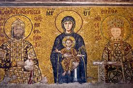
Part of the reason I created an "Angels & Icons" series came from my love of religious mosaics and Russian Icons.
glass mosaic
glass mosaic
My first attempt at paper mosaic, influence by religious glass mosaics
Russian Icon
glass mosaic

There are more - check on my site for Saints, Angels, & Icons.

Arabic tile work, Louis Comfort Tiffany and Antoni Gaudi are other inspirations:


a paper mosaic I created to match my bathroom floor
Samarkand
Tiffany glass mosaic portrait
Travel also inspired me - to locations in the Mediterranean, but I have yet to visit Barcelona [home of Antonio Gaudi] or Samarkand.
my bathroom floor
an early attempt at junk mosaic -I created this in 2005 from buttons, beads, toys, etc.
Antonio Gaudi mosaic in Barcelona
Tiffany glass mosaic


The Empress Theodora and her retinue. I still have this drawing in my studio for inspiration


Please feel free to view my site [click the link below] or email me to ask questions, inquire about purchasing original art or to represent me at your gallery!
 

Saturday, June 25, 2011

The Kindest Cut

Yes, it's me and my scissors again.

I am working on this intricate portrait. As I was going yesterday, I started to think of how many times I cut ONE piece of paper to create the "tiles" I fit together.

  1. First, I cut the from the "raw material"- whether it's a postcard, catalog cover, packaging, business card...etc. One hack to separate a block of color from the rest. 
  2. Next, as I go through any particular box of colors, I look for the exact shades and CUT a strip.
  3. I cut the strip into squares. 
  4. That's two cuts - one on each side.
  5. Now, some of the pieces are fine as a square, but not too many. If it's good the way it is, it gets glued.
  6. But, if I'm going around a curve, there's another cut to make it fit.
  7. If it's in a tight spot, it might take another trim or two
  8. or another. I counted. Most squares get cut at least once more, many of them three times. Which means I'll glue it down, pick it up, trim it again.
Sure, it's pretty tedious to cut ONE PIECE of paper [and there are hundreds if not thousands included in each piece of work I finish] as many as EIGHT times, just to get it right.

I never repeat the same source of paper next to another - so if you'll look closely, you'll notice bits from that postcard from the neighborhood dentist is next to an old birthday card, next to the Nordstrom catalog cover, next to the insurance salesman's business card, next to a magazine fly card, a movie ticket... and so on. Why? It's just the way I do things.

So, I am somewhat process driven, somewhat image driven, and color is always behind everything.
Check out my work here: http://www.schimmelart.com

Friday, May 20, 2011

Rollercoaster Redux


I create art from all sorts of twisted inspiration. I see an image, it starts going where it's going and I follow it.  The impulse is the action.

I have an affinity for music, and sometimes a simple song inspires me, but then the materials at hand take me somewhere else, and then...I take off in another direction. 

Sweet Honey Rox...before
A few years ago, I created an image of a fabulous diva inspired by an Ohio Players album cover. Boy, am I giving away my age. Anyway, I remember this gorgeous black woman pouring honey all over herself - and so gave my subject golden skin and 
Sweet Honey Rox for a title...
{there she is on the right with her arm up in the air}


The Ohio Players were famous for the FUNK and a song called Love Rollercoaster. Click on it to hear it on UTube.
And, for racy album covers...nudity...bondage...honey.


I was in Pittsburgh in January. I visited the Warhol museum. I was really moved by Andy's early work - illustrations, cards, advertisements, shoes, fairies, etc. 

There was one piece I loved - darn, all I wrote down was this note - "GOLD DOILIES." 
And, I wrote Sweet Honey Rox on it too. 

Well, I can't share the Warhol with you...but I came home and got me some GOLD DOILIES...and my scissors...and glue... and whaddya know. Sweet Honey Redux.

Now that I looked them up,I realize the image I was thinking was my inspiration was actually a series of Ohio Players album covers... Ecstasy, Pleasure, Pain and Honey [featuring Sweet Sticky Thing].


So, here is my funky and fly Sweet Honey Rox Redux

...with thanks to the Ohio Players and Andy Warhol. 

Somewhere in the 70's, they both got under my skin and in my grey cells. Let me know what you think. And check out the DOILY details!
doily detail!


Inspiration...the memory of an album cover, coupled with a visit to a museum, a beautiful woman, an emotion and a couple of hands holding scissors and glue.

Monday, May 9, 2011

The connection between advertising and art [mine, anyway]

original ad [I found it]
An ad for Target a year ago was SO cute I hung on to it. A girl with a wistful expression and long straight hair in a cute spring dress...flowers in there somewhere.

original painting
A few weeks ago I painted a woman with long hair... and a long neck...and although I always start with a painting, my work doesn't always end up looking exactly the same [to me, anyway]. I still had that Target ad in my head. But, I didn't use it as a reference, and as someone with eidetic imagery, I didn't need it. It's not the girl from the ad.

I started the mosaic. I had drawn a lot of diverging lines, but ended up using only a few as a guide. Black, grey, white, cream... cutting all my pieces and placing them just so...

Somewhere in there, I decided on ditching flesh tones for the shadows. Gray highlights in her hair got a coating of periwinkle metallic glaze.

I found a piece of junk mail [to me, anyway] from a food bank in Israel [?] with gorgeous tones of periwinkle. That ended up being a key color, so I sorted through the "blue" box to find coordinating pieces. Nothing matchy-matchy.


What's the connection between advertising and my work? Well, for one thing, we're bombarded with images of beauty in advertising. They are the basis for the images I paint. Then, I use images from advertising to create my paper tiles.

No magazines, I use advertising that comes to me... mostly junk mail: flyers, postcards, catalog covers, advertising ephemera, fly cards, etc. Even gallery cards. 
almost done

I thought I was done. Background done. Stood back... zzzzzzzzzzzzzzzzzzz bored?
Did it need something else?

I revved up that eidetic imagery and "remembered: that ad again - that original inspiration from a couple of years ago and decided to use that as a "jumping off" place. I designed and hand cut flowers. And stems. I placed them where I thought they ought to be. All the while thinking, geez this is going to look like that Target ad - busted!

But, after all - I'm no longer bored. There is no story to this image. No deeper meanings. Something beautiful that hopefully evokes an emotion. I really like it, and whaddya know, it looks NOTHING like the Target ad.

"Poppy"

The Blogosphere!

So, I got a request for images for a blog. Sometimes I respond, sometimes I don't...depending on the blog. If it looks like an aesthetic fit, them seem legit, and they ask for PERMISSION to use my images, and they PROMISE to add a link back to my site, I say yes.

Am I crazy? Or crazy good?

So the latest, blog, My Modern Metropolis did a short story, but included a lot of pics. Thanks, Alice - that was wonderful.
But then... off to cyberspace! Blogs picked up the story and reblogged it all over the world.

Off it goes. Liked on Facebook, Tweeted. Somehow, Flavorpill picked the My Modern Metropolis story verbatim. On to Tumblr. From there to many other blogs including pretty propaganda and hundreds of others. Most just posted a photo of one of my pieces. Some of them included my name, some got my gender wrong [should it matter?], some got my name totally wrong! Most left my name off... and images are just floating around...

What's your opinion? Should it bother me? I'd love your opinion...

Wednesday, March 23, 2011

What I won't do, darn it!

I love my collectors. They obviously have great taste, they like my work! They "get it." Most of the time. But I have to say...at this point in my career, I am no longer open to "suggestions."

I've spent my lifetime developing a style, a technique, a voice. I do what I do because it works for me. It brings me great joy. I know what I like, I know what I'm good at.


I also know my art is not controversial, not earth-shattering... I utilize a couple of gifts and quirks - I am eidetic, I have synesthesia, I can draw, I can paint, I have skill in cutting up paper to make my work.

I create portraits, I think they're beautiful. I am inspired by women's faces, by fashion, by travel, color, or an idea. I'm not curing cancer, I'm not trying to be clever, I make pretty pictures.

I am not a performance artist. I don't arrange shoes or shower curtains "just so," I don't dig up galleries, I don't utilize bones or doilies or pornography in my work. I don't pee or smear poop on my work.

I usually don't paint men. I'm not great at landscapes. I might feel like painting flowers but it goes away.

I want my work - the work that comes out of MY HEAD to sell. I will not apologize for wanting to make a living as an artist. Sorry, I don't want to either suffer for my craft nor do I wish to sell out. 

I do NOT paint dogs. Or cats. I do NOT paint cars or motorcycles. I do NOT do company logos. Yes, people so insane for their pets and yes, people spend a fortune on them... and yes, people with money have cars.

I have friends who paint pets and motorized vehicles. They're really good at it, and they make money selling their work. And, they LIKE it! I have graphic artist friends who create logos for a living and they're happy, too.

Me, I'm happy making beautiful women out of little pieces of junk mail and discarded paper. It's my thing. I love it. I am thrilled to be able to make art every day. I am also thrilled when it sells. It's confirmation that this work makes my collectors happy, too.

I show my work in galleries, have had a few museum shows, and I continue to work hard making better work every day. Thanks to you who appreciate my point of view, I love you, too!

Visit my web site to see more...
Schimmel Art

and please email me to chat!
Sandhi

Tuesday, February 1, 2011

Commission Time!

Shut Up and Kiss Me Again..and Again...and Again!
There's both an upside and down when it comes to commissions. 

Of course, it's great to have your work desired. And, getting paid to do what you love is also a wonderful boost. The downside? The internal dialog you have with yourself - second guessing each move? Will they love it or hate it? So, while you're working on the commission, you may not be entirely confident*

So far, my experience with commissions has been very positive. Whether creating a commission for a celebrity or of a celebrity... or a civilian just like you and I... I've done custom portraits from photos, or created completely original work for corporate offices...

Well, there was that one...when the collector asked for something "just like" another piece I'd done...except a different shape, a different color scheme and a slightly different composition. Her reaction was…remarkably quiet.

What to do when you're asked to create a portrait of a subject you've done before? A commission for a collector - or through a gallery. This is a bit of a dilemma... you don't want to alienate the collector who has the original. 

But, let’s think about this – I believe some of the greatest artists re-created portraits of the same subjects over and over – whether their wives, lovers, mistresses, especially self-portraits… so maybe it’s not a complete sin?

For some reason, some of my images have been really "popular." Of course, each time it’s a complete original…new composition, new materials, new color scheme.

So here’s my latest, a huge version of an image I originally created a few years ago. 

And, a new version of another image is getting shipped to a gallery [the original sold to a museum]. The collector had wanted to purchase it, but it was sold before he made a decision! This one is “sort of” like the original, but not the same.

As a working artist, I have to juggle all sorts of opportunities – requests for my time while attempting to follow a strategic plan; while fielding inquiries from bloggers, trying to coordinate shows in galleries, exhibitions, working with the media, doing the laundry… and making sure the “working” part of working artist includes making a living.

So, I will accept limited commissions for images I’ve created before – as long as I can make it different and make the collector [and the artist] happy!

*I have to go now - and contact a woman who wants a custom commission and ask her to send some more photos… I painted her portrait last night and I’m not happy with it…!