Showing posts with label fine art. Show all posts

Monday, March 23, 2015

The oddly glowing and extravagantly bejeweled Blue Hippo of Luck and Love in Situ.

 
Imagine you are wandering on your own, contemplating your future when your reverie is interrupted by a huffling noise amid the nearby grasses. A grunting noise accompanied by that of squishing of muck and mire, green blades of grass moving to and fro. You explore further and come upon a clearing - a puddle of mud occupied by a single, blue hippopotamus.

This beast is not only of unusual color, but also covered in a pattern of sparkling jewels. He glitters in the sunlight, his eyes are shimmering sapphires. Typically, hippos are dangerous to humans, but this particular specimen is not. In fact, you have discovered a mystery, a good luck charm, an enchanted being with the power to distribute luck and love to those who find him by accident. For those who need a boost of luck, or a true love to arrive, you only need to find him.
Gaze upon him, then close your eyes and visualize that which will fulfill your heart's deepest wish. His power is yours for just a moment, as he will disappear as quickly as he arrived.

The Oddly Glowing and Extravagantly Bejeweled Blue Hippo of Luck and Love In Situ.

Sandhi Schimmel Gold's Blue Hippo
in si·tu
/in ˈsīto͞o,ˈsē-/
adverb & adjective
adverb: in situ; adjective: in situ; adverb: insitu
in its original place."mosaics and frescoes have been left in situ"
in position. "her guests were all in situ"


Wednesday, October 29, 2014

Shut Up and F*@$ing Kiss Me, Already!

Shut up and Kiss Me...again! Again!

I've always wanted to show my art in Miami. It's been a goal to get into Art Basel, but I'm not represented by a gallery that will be there. So, I found another way to be Art Basel-adjacent.
I have a few things I want to show, but the most popular image I've ever created is called...
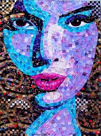
"Shut Up and Kiss Me."
I got out the sketch book and played with an image I've done before... a few times, in different sizes, different color schemes, different styles, different compositions each time.
They're not the same!
They're all one of a kind, all drawn by hand, using a whole group of new materials. I improvise as I go...after all, the impulse is the action!

Newest version, bad lighting...in my studio just after completion.

I decided to share a bit of my process with you by taking photos as I went along...  you'll see, if you look closely, I change the drawing, the color scheme, and make adjustments to different features. And, it's all done by hand, there are no computer programs that I use, just old-fashioned ART.
I hope you like seeing the process over a length of time.

Some of the strips of orange junk mail I was sorting...and my high tech cutting tool!

One version, in a private collection in New York

Another version, in a private collection in Texas

Another version, in a private collection in Mexico
The newest version is 30x40" - and will debut in Ft. Lauderdale, Florida - November 15th, 2014
You're invited!
click here for more info on the opening                                            
And then here:


Monday, September 23, 2013

But does it match the couch?

At an art festival this weekend, I was approached by a really interesting character who got my grey cells bouncing around my noggin'. He called himself Seemore. [Have you met him?} His name is
SEEMORE
Charles Simmons and he is a BIG booster for his home town.


Occasional art festivals are one way I get to meet the public, take my show on the road... and hopefully make some sales of my work. Say what you will about art... I consider it my profession, and have no qualms about finding various ways to make a living.
It's a mixed bag.

Anyway, Seemore stopped by and told me he was looking for 
the next Martha Stewart. He thought it might be me! [Or maybe he says that to all the girls... or every artist he meets...] 

Well, I consider myself pretty clever, creative, can do all sorts of things... I can draw, and paint and grout tile with the best of them. I can design clothes, I can make a sample handbag from my own designs, I can dress a mannequin, darn socks, dye easter eggs, create sets for theatre, fashion floral centerpieces, do window displays, am a gourmet cook, do creative writing and make all sorts of art and craft thingamabobs. I don't have any livestock, but would love a sheep in the backyard to match my designer dachshunds. So, perhaps I fit his bill for the next Martha?

Seemore's actual purpose in attending the show was to find people [like me?] to come to High Point, NC. To visit, to perhaps participate in trade shows or be/display/rent in a showroom? I'm not quite sure. But, to be "discovered" as the "Next BIG Thing" seemed to be what he thought I could achieve in High Point. Or not. He was very honest.


"Dakota Daughter" Scottsdale, AZ
"Sheherazade" Stamford, CT
A RED wall!
He said some marvelous things about my artwork. And, my sense of color. However... he also uttered the phrase...asked the questions that many artists abhor... "But does it match the couch?"

 Apparently, interior designers who pick furniture, fabrics, accessories and ART for their clients in High Point and every where else... can make an artists' career if their work "matches the couch."


A Blue couch!
Seemore suggested I create work that will match fabrics and interiors that designers look for... and although I could almost say color schemes and palette I pick are something I "can't help doing" - from my inspiration in the moment, my thought process... I don't know...
Am I crazy for using COLORS??? 

"Ever" Museum Collection
Outrageous color combination!
Should I start perusing magazines looking for the latest trends in interior design so I can be more marketable? 
Are we still in the Tuscany trend? 
I haven't painted any villas or poplars recently...[ever?]


"Chauconne" Houston, TX
I never really thought about it before, and all the pieces shown here have sold... so someone somewhere must like red, purple, orange, yellow, teal and lime green! I guess a small minority.

I know most people are afraid of color [I had to paint my last house BEIGE so it would sell].

PURPLE????
I know most people don't like portraits. I know most people can't afford to buy original art. I get it, I get it...

If the point of making art... is not only to express yourself, but to also earn your way, pay your bills and put your kids through college - is that unreasonable? Is it time to SELL OUT and go beige or greige or sage green?

"The Karen E Project" Redondo Beach, CA
"Coco Rocha" New York, NY
"Can I get a Kiss? - Mexico City

 
What, neon colors? Unheard of.
Speaking for myself... Is creating DECOR that matches the couch the way to go?

An orange couch?
I guess I could make a lot more money if I did dog portraits...or flowers... or aspen trees... or landscapes or ponds or... the dreaded 
giant pear paintings. 

But, when I walk into my studio - and just create out of my
imagination, faces appear on the canvas 9 times outta 10. 
Colors that may or may not "go" together, or match a couch [Okay, I am being a smart ass here and I know it] get tossed together willy-nilly.

I know there is no real answer here, and I am sure if anyone bothers to comment... the opinions will be wildly different.

"Robin's Blue Bedroom Eyes - San Diego
Teal and Brown...that's more like it.
I am really glad I met Seemore, and might go visit him in High Point, or take a gander at design magazines... after all, being the next Martha Stewart would alright with me. I am sure I can stay out of prison or if I did end up in jail, I'd take up
Martha upon her release...with her knitted poncho
knitting ponchos, too.

Or better yet...  
the next Walt Disney
[after all, Walt & I share the same Myers Briggs ENTP personality type]

Like Seemore said...  
"You never know when Mickey Mouse is going to become Disneyworld."

So, what do you think?

By the way, if you want to be on my email newsletter list... 
go to THIS page and sign up.

Thursday, January 17, 2013

"Peor es Nada"

So - who are you - the product of your DNA or who society labels you as?


This is a new, original mosaic portrait I created in my "True, the Looking Glass" series.

In 1835, a schooner named “Peor es Nada” left one of the Channel Islands after gathering the the last of the surviving natives, the Nicoleño people. One woman was left behind. The accounts of the reason vary - perhaps her baby was not on board, or she went back to the village for a prized possession. Did she jump ship or just not make it in time? A storm arose, she had not returned and the ship sailed back to the coast of California.

Over the next 20 years, this Nicoleño woman lived alone on the island. She learned to make baskets from wild grasses, to fish, to hunt seal and otter and built a dwelling from old whale bones. She sewed herself a garment from cormorant feathers and seal sinew. She survived inclement weather, fought off wild dogs and alluded hunters and hostile visitors to the island.

Meanwhile, her people were sent the San Gabriel Mission in California, and she was all but forgotten.  Her people were absorbed into California and all aspects of their culture and language disappeared.

Eventually, Captain George Nidever landed on San Nicolas Island in 1853 and found the lost woman. She boarded his ship with her bone needles and a basket, wearing the feather garment [and not much else!]. She was taken to the mission in Santa Barbara.

Now, she was a ward of the Nidever family and the Mission. No one could understand her language, including Chumash Indians from other Channel Islands.

The lost woman was given a new identity - new clothes, a new name, a new religion - she was baptized Juana Maria [even though she did not understand what that meant] and something else - foods she was unfamiliar with. This new diet quickly made her ill and she died within seven weeks of her “rescue.” She was buried in an unmarked grave, used for "Indians."

The phrase “Peor es Nada” can be translated as “Better than Nothing” or “Worse than Nothing” - This portrait is my loose interpretation of this story of lost identity - the two faces of the woman - the ward of the glittering church with a fresh new identity - and the brave, wild native woman adorned in cormorant feathers. I’ll let you decide which interpretation of the phrase works best.

The medium used - recycled paper, paint, feathers, jewels and yarn. On canvas: 24x36” Due to the delicate nature of the medium, it must be framed behind glass. Please contact me for pricing.

If this story sounds familiar, a fictionalized version was captured in the book Island of the Blue Dolphins  and later into a film of the same name. If you have children, it is a wonderful, well-written story, albeit frightening for little ones.

The “truer” story of the woman can be found here.

Tuesday, February 1, 2011

Commission Time!

Shut Up and Kiss Me Again..and Again...and Again!
There's both an upside and down when it comes to commissions. 

Of course, it's great to have your work desired. And, getting paid to do what you love is also a wonderful boost. The downside? The internal dialog you have with yourself - second guessing each move? Will they love it or hate it? So, while you're working on the commission, you may not be entirely confident*

So far, my experience with commissions has been very positive. Whether creating a commission for a celebrity or of a celebrity... or a civilian just like you and I... I've done custom portraits from photos, or created completely original work for corporate offices...

Well, there was that one...when the collector asked for something "just like" another piece I'd done...except a different shape, a different color scheme and a slightly different composition. Her reaction was…remarkably quiet.

What to do when you're asked to create a portrait of a subject you've done before? A commission for a collector - or through a gallery. This is a bit of a dilemma... you don't want to alienate the collector who has the original. 

But, let’s think about this – I believe some of the greatest artists re-created portraits of the same subjects over and over – whether their wives, lovers, mistresses, especially self-portraits… so maybe it’s not a complete sin?

For some reason, some of my images have been really "popular." Of course, each time it’s a complete original…new composition, new materials, new color scheme.

So here’s my latest, a huge version of an image I originally created a few years ago. 

And, a new version of another image is getting shipped to a gallery [the original sold to a museum]. The collector had wanted to purchase it, but it was sold before he made a decision! This one is “sort of” like the original, but not the same.

As a working artist, I have to juggle all sorts of opportunities – requests for my time while attempting to follow a strategic plan; while fielding inquiries from bloggers, trying to coordinate shows in galleries, exhibitions, working with the media, doing the laundry… and making sure the “working” part of working artist includes making a living.

So, I will accept limited commissions for images I’ve created before – as long as I can make it different and make the collector [and the artist] happy!

*I have to go now - and contact a woman who wants a custom commission and ask her to send some more photos… I painted her portrait last night and I’m not happy with it…!

Monday, December 13, 2010

Everyone's A Critic!?

I took my daughter to National Portfolio Day so she could meet art schools she is interested in attending. I always thought she had talent, she's been drawing since she was a baby. In fact her drawing at age 2 led her to the Center for Academic Precocity.

She gets straight A's in Art, has taken extra-curricular art classes and is the president of the Art Honor Society and volunteers for Free Arts.

I know I am biased. But I thought the schools would be somewhat impressed...

She brought a portfolio with drawings and paintings.

Now, mind you, she's an honor student, taking AP classes, with great grades...and when not doing homework, she's in a band [and writes music], lies on the couch and has pretty normal life. So, I suppose she should have spent more time making art or taking more art classes... perhaps her portfolio was a bit slim?

Is she the most talented 18 year old? Probably not... I wasn't expecting her to be swept up museum curators upon entry.

I expected a little more consistent feedback. Oh, no one told her she was awful, or wasting her time, but I was surprised that the critiques were completely contradictory!?

School one - Do more figure drawing. Not from photos, from life. Your paintings are your worst work. Work on shading. Your drawings in graphite are your best work. Forget Fine Art, go for Illustraton. Not impressed, but the critic is in the photography department. Do more drawings and send them in [uh... deadline for application is NOW-ish?] not exactly encouraging, but not bad... at least they had a conversation and he was not discouraging her.

School two - Do more still lifes. Your paintings are flat. No other feedback.

School three - Very positive, actually really liked some work [paintings] and gave her some hints on improving work and how to edit her portfolio for submission. They talked at length about the school, the town the school is in and how she would fit in. But, this was never a school she considered.

School four - Your paintings are your best work. Your work is best when telling a story. Come visit the school. [I know this school values academics as highly as art work]. It was worth waiting over 2 hours in line for that...

The lines for the other schools she was interested in were WAY too long,  so we were out of time. I wouldn't say she was discouraged, though - she was given a lot of good ideas, inconsistent as they were. She has a lot work to do - too bad finals start this week.

BTW, she wants to be an Art Teacher.

If you think I"m a whining, unrealistic Mom - NO - I know she will be faced with criticism throughout art school - same thing with any artistic endeavor. And I know better than anyone you need to develop a thick skin and a strong point of view.

In college, my life drawing prof absolutely ignored me the entire semester. Would not look at my work or speak to me, gave me no feedback whatsoever... until the final critique, when she said my drawings looked like cartoons...[thanks for all the help, bitch!] and one painting prof told me to stay home and create 12 paintings...that I didn't need his class [lazy me did so, got an A, but didn't learn a flipping thing from him!]. And I would suggest not taking Art History at 7:00 a.m. - they dim the lights and a monotone professor will put you right back to sleep during the slide presentation.

I was wondering what would have happened if I had taken MY portfolio in for review. At every art show or gallery opening, viewers positively swoon over my work, but I can image the comments from critics now... don't worry, I can take it.

Here's some I've had in the past mostly from galleries that actually SELL my work:
You should paint celebrities.
You shouldn't do close-ups... put your subjects in a room.
Your strongest work is portraits,
Ah, your work is just pretty pictures, it needs to be about something.
Don't put writing or words in your work.
Work bigger, much bigger.
We can only sell smaller pieces.
Don't paint celebrities.
No one like portraits, can you do landscapes?

Do you think being an artist is easy? Do you think being self-employed is a dream? No bosses?
Ha - a self-employed artist has a million bosses - critics, gallery owners, art-collectors and everyone who sees your work in person, everyone's a critic!

Get ready, daughter!

Tuesday, August 17, 2010

Ever Fallen in Love with Someone...

With someone you shouldn't've?


There are two songs that inspired this new piece, "Ever" - 
one is Queen Bitch by David Bowie, the other is  Ever Fallen in Love (With Someone You Shouldn't've) by the Buzzcocks...I like this version by Billy Talent.

You know the feeling - you're pissed - you're heart's in the basement your weekend's at an all time low... you're up on the 11th floor...gazing at your hotel walls...and you're phoning a cab, and you're stomach feels small...
You've fallen in love with someone you shouldn't have fallen in love with.

Love doesn't always end well. Sometimes it just STINKS. If you haven't been there yet, you will be someday. It's good to have a great song to blast and sing along with during those moments of fury. These two worked for me [oh, a long time ago, kiddies... I'm happily married].
So, here's a hot red-head. Naming her "Ever" just 'cause it's pretty. What YOU need to figure out is whether she's the mean one, or if she's the angry one because her lover is fooling around somewhere else [perhaps with someone in a bippity-boppity hat?]. 

"Ever" is a lovely mosaic created entirely from junk mail - 24x36" on canvas...like all my other art.

Have you seen my slideshow on Planet Green? 
Did you know I am teaching art classes in Phoenix?

Hope to hear from you - let me know what you think!

Sandhi

Thursday, February 11, 2010

Urban Geo-Scape

What's an Urban Geo-Scape?
This.....----->>>>>

Not a very good photo, but you get the idea.
Abstract
Stylized City Scape
Geometric Shapes
Urban color scheme...

Urban Geo-Scape

This one is 24x36" junk mail - on masonite
White, Black, Shades of Grey
Acid Green, Orange and Red.

Framed.

Friday, January 15, 2010

Mother Nature - Inspiration

This is my newest piece [until later today, anway]... Mother Nature is 24x48" on canvas.
While working on my Angels & Icons series, my friend Julie suggested Mother Nature... and that I would figure out a way to incorporate branches...perhaps coming out of her head!

When I drew this face on the canvas, I was thinking of a more traditional tree...but came across an invitation to a grand opening event in San Diego put on by Ran Roy Printing - that featured my art. Lisa Sinclair from Ran Roy called to say they had left over invites, did I want them? Sure! So, the invite featured a bird in a flowering tree. The branches were swirly... and you know, I love swirls.

So the branches became swirls - sort of like ferns - billowing out of Mother Nature's head... thanks, Julie!

I decided to use the colors of earth, sand, dirt as the tones in the face. I sorted the pieces by shade and after creating all the darker shadows, started with the darker shades and moved toward the light - using lighter shades as I went... All of the colors in Mother Nature are pretty natural. Look closely, you'll see some pieces of the invitation in her hair.

The photo doesn't do her gaze justice... she looks pensive, maybe a little suggestive [slightly open mouth].

The colors are browns, greens and a little red & black.

By the way, Ran Roy printed my greeting cards and prints - 8 different images as cards, 12 images as prints. Check them out here.